Branding
Museum of Ice Cream Rebrand

Year
2026
Tools
Illustrator, Photoshop
Overview
/Objective
1) Find a Space and research to understand the space: name, functions, goals, values, problems, user groups.
2) Evaluate current design assets if it has.
3) Present 3 different Public spaces and mockup ideas.
4) Finalize brand identity and develop logo and graphic sketches.
5) Develop Collaterial & Marketting Material.
6) Finalize collateral mockups.
7) Create a 20 x 28 Informational Poster.
/Design Statement
For my public space, I decided to focus on rebranding the Museum of Ice Cream. I chose this because I really love how playful, fun, and unique the museum is, and I’ve always wanted to visit it. I also felt that its branding had the potential to be even more playful. My idea was to create something that brought youthfulness to the brand by using bubbly typography and cool-toned pastel colors to give it a cold, almost Arctic vibe. My goal was to make the branding highly illustrative to reinforce the youthful feel, with a polar bear mascot as the center of the brand.
For my collateral assets, I created an ice cream cup, ticket wristbands, tote bags for a merch shop, and a city billboard for my environmental space collateral. Overall, I feel that my artistic direction created a more playful space where I can envision younger audiences having a great time exploring the museum.
Process
/Moodboard
I chose to focus on the Museum of Ice Cream because, after examining its current logo and branding, I felt it could have more of the childlike, playful spirit that it seems to be missing. It didn’t feel very playful for a museum that advertises itself as a place where people can have fun.
I planned to bring more youthfulness to the logo by using bright, pastel colors, bold typography, and incorporating a mascot, making the branding more recognizable. I also aimed to make the overall design highly illustrative to further emphasize a youthful and engaging feel.

/Logo Sketches
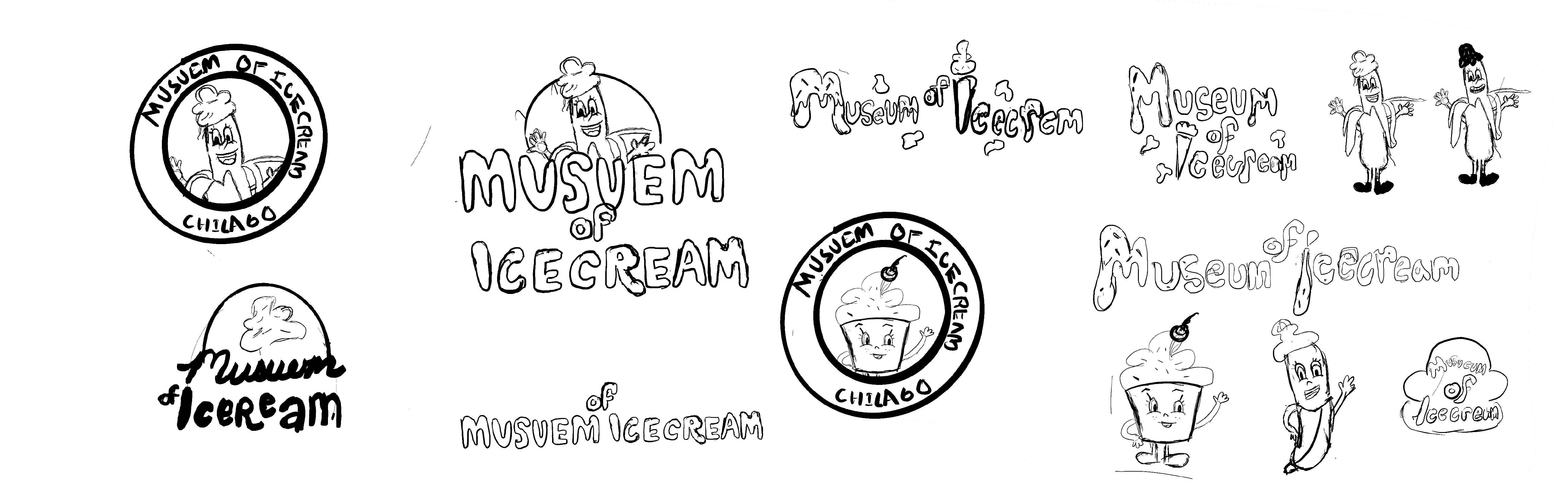
In the beginning, I knew I wanted the mascot to be the brand’s main element to make it more recognizable. I explored different mascot ideas, such as an ice cream cup and a banana split. For the typographic logo, I wanted it to be very colorful, with bubbly lettering and sprinkles.
/Primary Logo
After experimenting with creating an ice cream cup mascot, I decided to go with a polar bear because it still fit the ice cream branding. My vision was a cartoon polar bear with ice cream on its head and around its mouth. I experimented with different shades of yellow, then added pink to make the blue pop more, and used an off-white to represent the ice cream flavor.


/Typogrpahic Logo
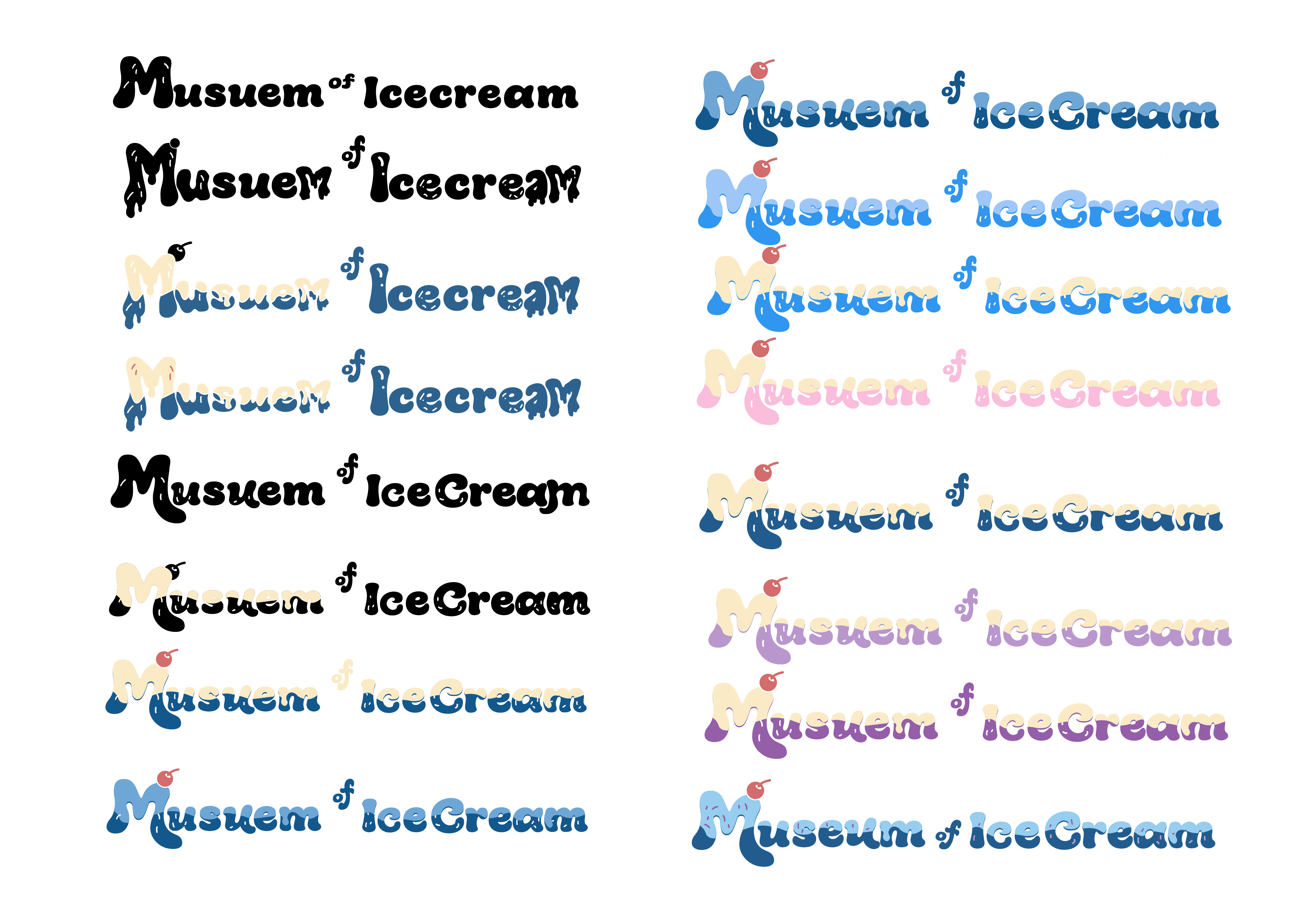
For the typographic logo, I knew I wanted to use a retro, bold, bubbly font because it gave a nostalgic, old-school ice cream vibe that aligned with the museum’s focus on the history of ice cream. At first, I experimented with making the type very drippy, but I decided it would be more effective to keep the drips subtle and instead focus on customizing my letterforms rather than pulling from different fonts.
/Billboard Draft
During the billboard design process, I focused heavily on the typography and which words should take center stage. Rather than using a linear layout, I decided to follow the curve of the frosting and create a wavy type. I also experimented with color and ultimately chose a lighter blue against a whitish-blue background, as the off-white felt like too much contrast against the dark blue of the font..

/Ice Cream Cup Draft


/Ticket Wristband Draft

Old Branding

The Rebrand

Products
Final Product Look
Stickers
Social Media Carousel
View More Work...

Proffessional Work
Outreach Ambassador Work

UI / UX
GQT Movies App ReDesign

Editorial
Pop Art History Magazine

Branding
The Mermaid Tale Branding/ Wallpaper Collection

Professional Work
Purdue Bands & Orchestras Work